Avalara blog
As lead UX designer, I redesigned the blog experience for Avalara. I consulted with our information architect and lead UX researcher to start with a basis in user feedback (from preliminary user testing), IA best practices, and SEO optimization. I also relied on my own competitive analysis of SaaS (software as a service) blogs.
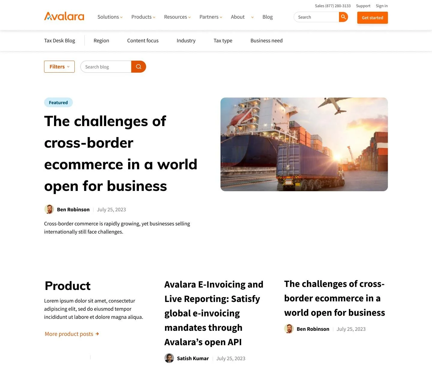
The Avalara blog contained a trove of content that demonstrated thought leadership on many tax topics and regions, but the visual design of the site was dated and did not communicate the value of the content. The browsing, search, and tagging systems were also less than optimal, and in addition to undermining the overall user experience, they weren’t helping the blog in SEO and search ranking either.
My approach entailed gathering requirements and research, conducting competitive analysis, wireframing in low fidelity, reviewing and presenting to fellow designers and stakeholders, prototyping journeys and key interactions, and designing in high fidelity. Finally, this would have been followed with the design of specific components within the blog journey, and revisiting areas with further testing.
Role
Lead UX designer
Objectives
SEO optimization
Visual design refresh
Demonstrate thought leadership
Results
Results pending implementation.
Expecting improved SEO and increased blog traffic.
Optimistic for higher newsletter subscriptions.
Would test blog filter menu and tagging system.
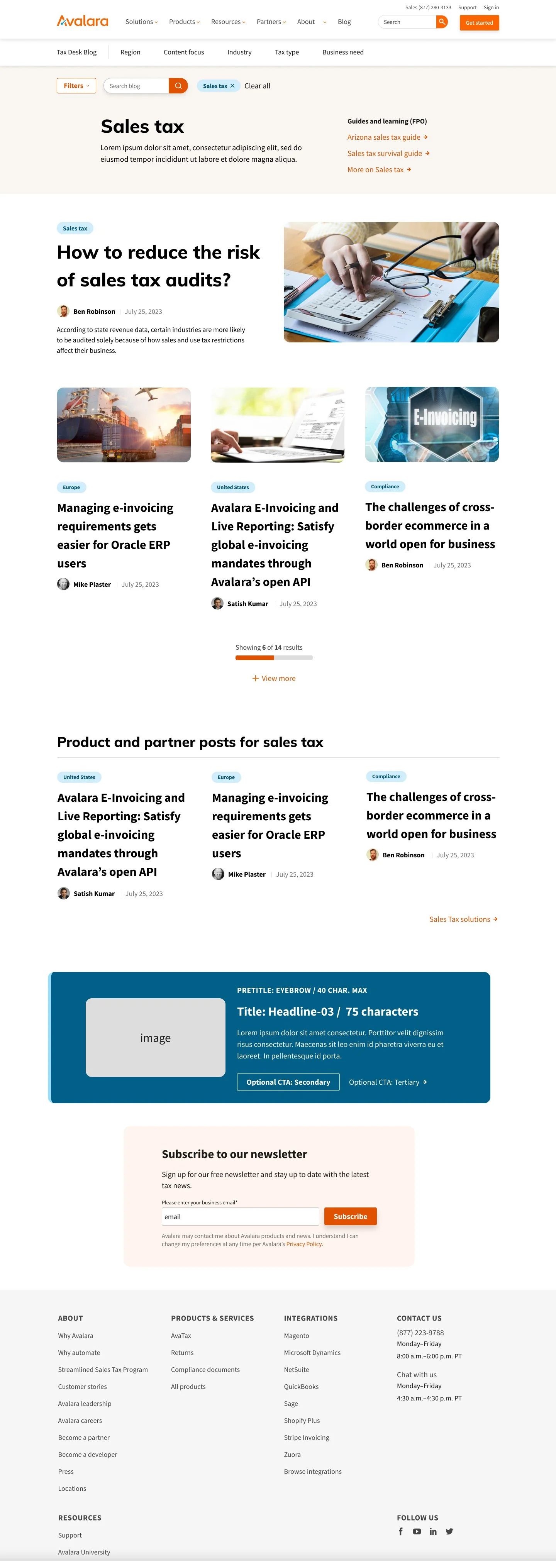
Visual design more contemporary and better reflects brand and value of content.
User testing results
Research wireframes presented test users with content groupings divorced from layout and design. Users were tested on these content groupings and key navigation elements.
More research wireframe examples
Internal audit (previous blog page designs)
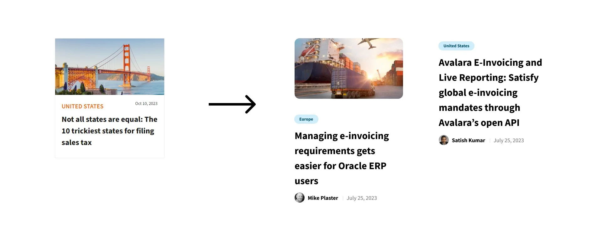
Previous blog landing page design. Outdated graphics take up a large portion of the top of the page. Card designs and stock imagery create a dated aesthetic.
Previous article/post page. Again, a stock photo takes prime screen real estate before the meaningful content is presented. Various elements, like the social media icons appear dated.
Competitive analysis (SaaS blogs)
I identified Salesforce as SaaS blog with similar breadth and complexity to Avalara. Salesforce has very appealing visual design and a sensible browsing experience. They manage this with mostly HTML elements and CSS, which is a best practice for maintaining design systems and optimizing page load performance. In contrast, static imagery like illustrations need updating on a case-by-case basis, and require more memory.
Salesforce blog landing page.
A snapshot of the breadth of competitive analysis examples
Wireframes (low fidelity)
I started designing in low fidelity. It’s important to work on the navigation elements, visual hierarchy, and page layout without being distracted by specific design elements.
Design decisions
No map interface in filter menu.
Blog dropdown menu required in addition to search and filter functionality.
Add author information to article cards. This serves as a valuable social proof to users.
My first round of wireframes started with the mobile experience. Desktop views were also rendered as low fidelity wireframes before being designed in high fidelity.


