Avalara tax rates
Product strategy identified reduced SEO ranking and a high abandonment rate on tax rate pages. I had also identified usability issues on many of the pages concerned.
Before I weighed various concepts for the entire tax rates user journey, I presented simple design updates that improved the usability of key tax rates pages, with the aim to improve the SEO rankings and abandonment rate. These “low hanging fruit” updates included removing uninformative and dated graphics, incorporating visual design more through the styling of HTML elements, and moving relevant tax rate information to the top of the page.
Later, I explored low fidelity concepts to envision how users could best navigate Avalara’s tax rate information. I worked with our UX researcher to conduct moderated user tests to challenge and validate our early concepts. The design solution we reached was a leaner, more optimized user journey that featured an interactive map of US tax rates by state. This allowed users to glimpse rate data at a high level, and drill down to more detailed locations and rates.
Role
UX designer
Interaction design, map navigation
Wireframing
Component redlines
Objectives
Reduce friction for users in search of tax rates
Reduce bounce rate
Present Avalara as the source of truth for up to date tax information.
Refresh visual design
Improve SEO
Results
Results pending development
Previous designs and observations
US sales tax rates, all states
Unnecessary and dated graphics at top of page.
Rate range (what users are looking for) is farther down the page, in a very long table.
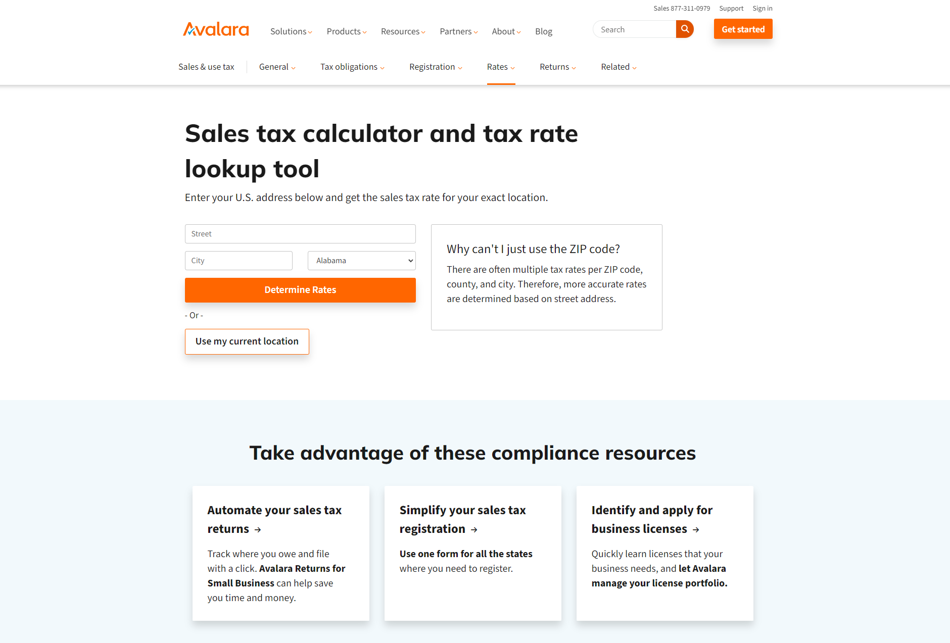
Sales tax calculator tool is on a separate page.
Experience is generally fragmented across pages in the sub-navigation menus.
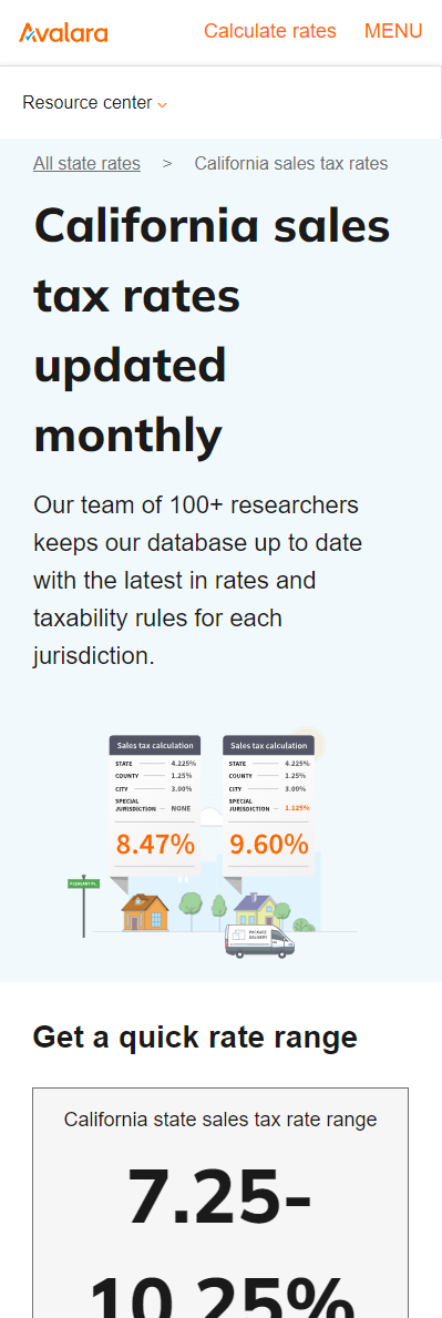
State sales tax rates
Unnecessary graphics at top of page, with misleading percentages in the graphic.
Rate range (what users are looking for) is farther down the page, and not appropriately emphasized.
Pages not templatized, each individual page is hard-coded (imagine updating 50+ pages with a redesign!)
Requirements gathering and KPIs
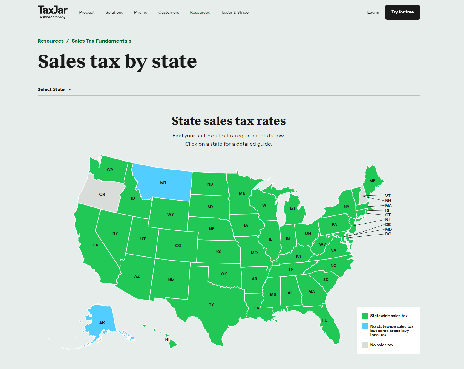
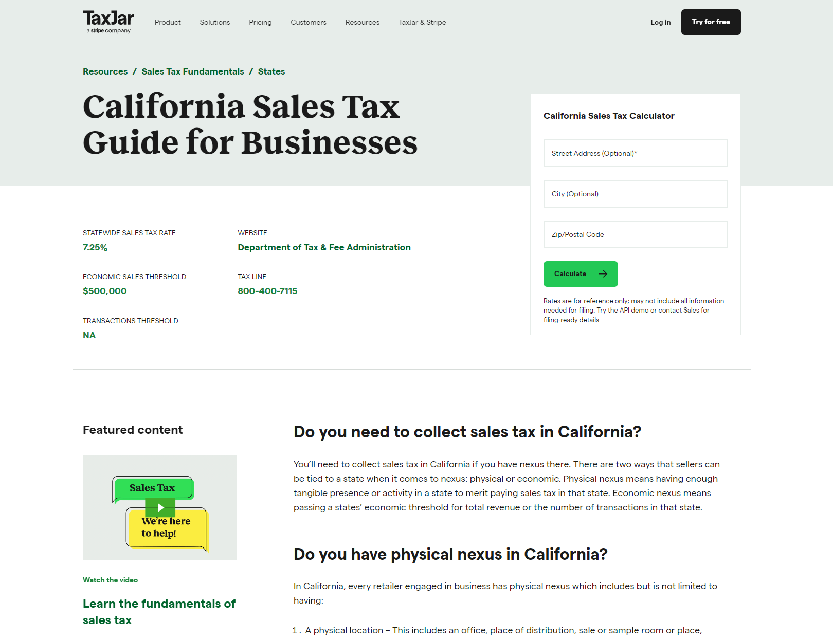
TaxJar
Very clean, on-brand US map infographic
Hover for tax rates, click to go to state page
State dropdown for additional navigation
TaxJar state page
Rate near top of page
Secondary information below
Sales tax calculator on page
Sales Tax Handbook
Less polished, but very high fidelity data
Tabular view for redundancy
Users can swiftly find the accurate rate information they’re searching for, and can find tools and products relevant to their needs.
Improve usability of pages [identified by design observation]
Improve tax rate SEO ranking [identified in stakeholder interviews]
Reduce journey abandonment [identified in stakeholder interviews]
Create vision/concept for the ideal tax rates user journey
Lightweight page updates. Improve SEO by removing irrelevant content and increasing the hierarchy of high value content. Optimize page load by removing uninformative graphics.
Explore concepts for how users navigate and search for tax rate information. Conduct competitive analysis. Conduct moderated user testing to challenge and validate early concepts. Templatize tax rates pages.
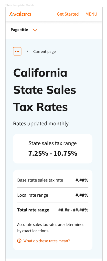
Usability update, state rate page
Old version
Design update
Competitive Analysis
Moderated user testing
US based accountants or business owners who were responsible for tax compliance.
Sales tax calculator
Entire page dedicated to tax calculator tool
Form requires full completion
Form has blanket error state for all errors, instead of specific error states (less helpful to user).
Approach
Wireframes (low fidelity)
Design decisions
Map presents more interesting and compressed navigation for tax rates, as opposed to a long table, and is more in line with competitors. Interactive map is also validated by preliminary user testing feedback.
Remove unnecessary graphics at top of rate pages.
Include calculator tool on rate pages, beneath the rates themselves.
Include dynamic sections for learning resources, tools, product info, and merchandising.
Updates to site must be templatized, not done page by page, state by state, county by county.
High fidelity wireframes
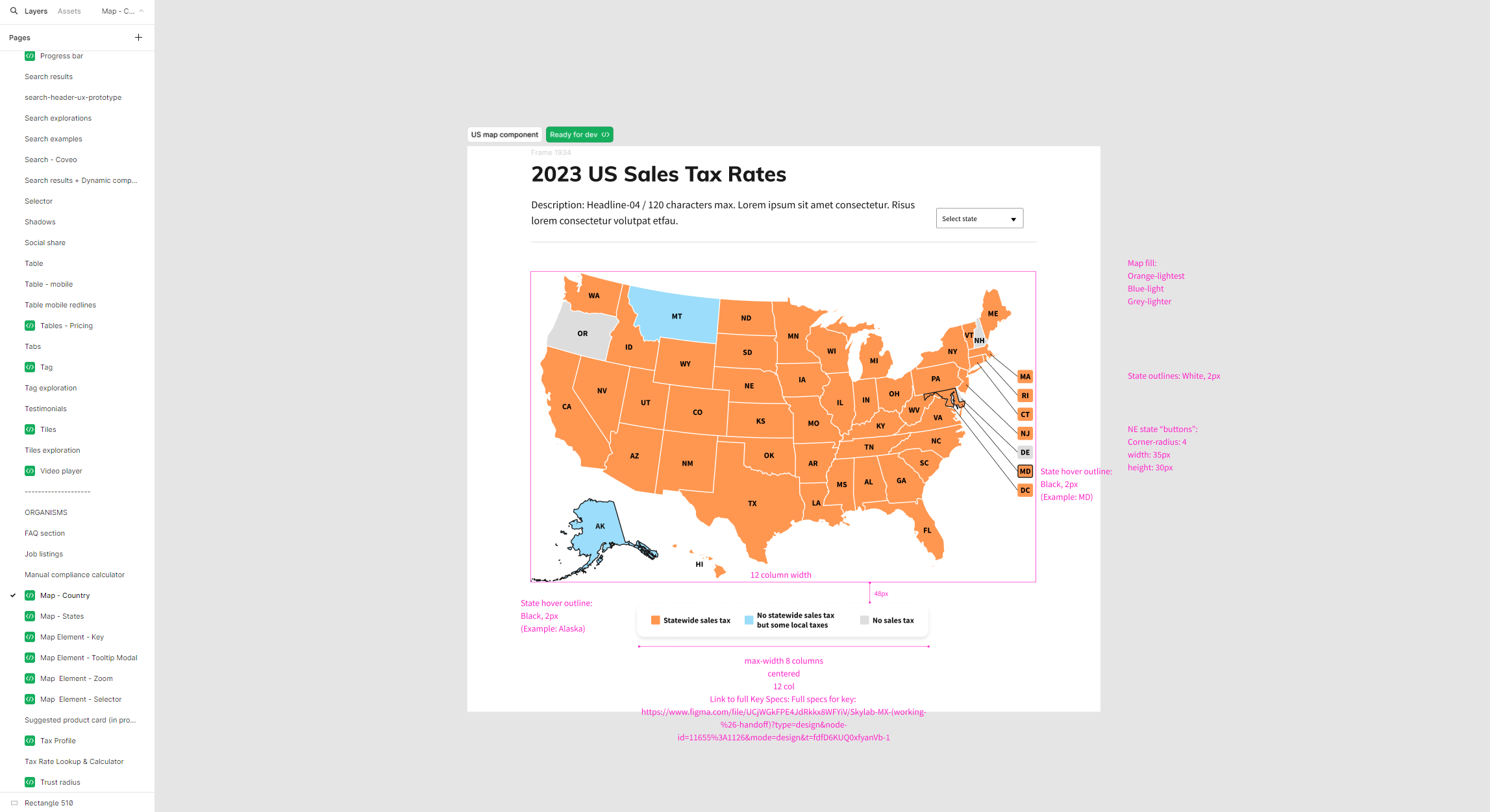
Map interaction design
Documentation
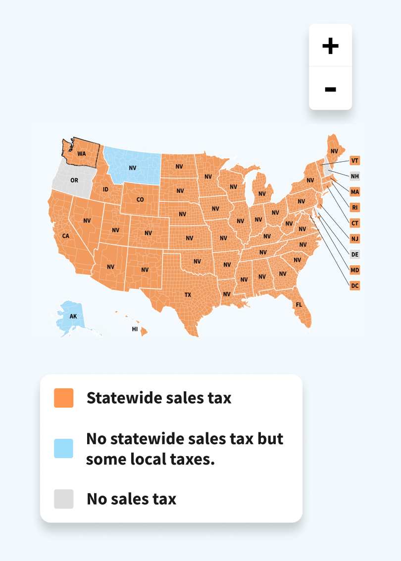
Mobile US rate map
Pressing a state in mobile displays an overlay of high level information, and a link to that state’s rate page.
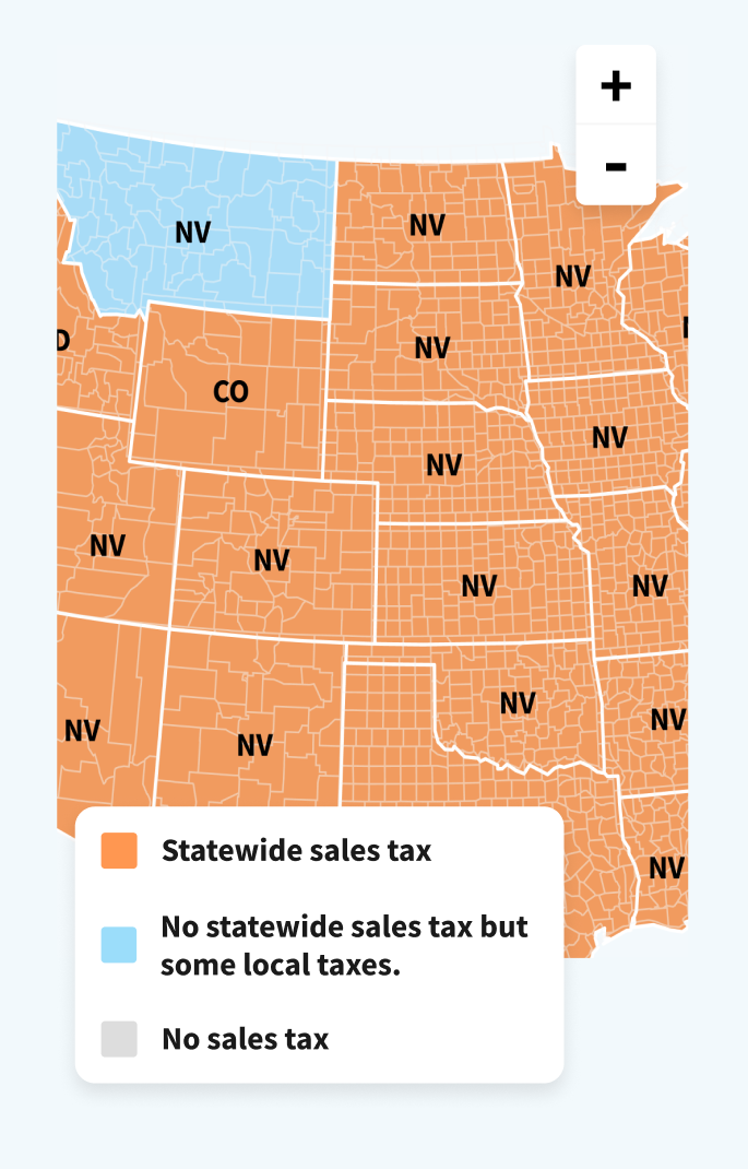
In later stages, the county lines were removed. These didn’t display relevant information, cluttered the visual design, and would have been time consuming to implement.
In later stages, the zoom toggle was removed, as users would likely pinch to zoom (following google maps interactions as an example).


