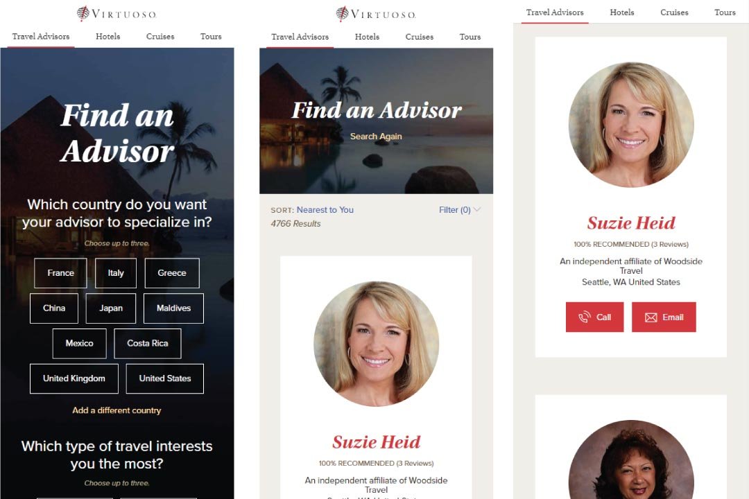
Mobile design, luxury travel website
Consumers visiting the site want to connect with or learn more about the company’s travel advisors. The company’s hotel, cruise, and tour products, along with traveler testimonials, communicate the value of finding an advisor through the company, and offer consumers the means to find advisors with contextual expertise.
Consumers are the primary user. The old mobile site was geared toward travel advisors, but about 75% of the site’s mobile users are consumers.
Wireframing, interaction design, competitive analysis, and visual design.
Role
UX and visual design, one of three designers
Visual design of site
Wireframing of advisor and hotel experiences
Objectives
Make mobile site a useable experience
Enable users to find travel advisors and experiences
Increase conversions
Results
25% increase in total site customer conversions
20% of all consumer conversions now coming from mobile devices
$10,000 estimated additional network revenue in just the first 3 weeks of mobile site going live
Information Architecture
A glimpse into the analytics on the site told us that mobile users would overwhelmingly constitute customers as opposed to other users, travel advisors and suppliers. About 75% of mobile users were consumers. With a focus on that user group, we placed an emphasis on the consumer browsing experience, empowering them to find advisors, hotels, and experiences that fit their travel desires. This approach also had the benefit of generating clients for travel advisors and adding value to the site network. We structured an information architecture based on browsing the site’s luxury travel products and connecting consumers with travel advisors with relevant expertise. This focus also allowed us to cut out or deemphasize much of the company’s business-to-business information and workflows, which could easily overwhelm consumers and erode their confidence in the company’s services.
Style tiles were a method of establishing a set of design patterns we’d need, and styling them in isolation, one set per UX team member. We ended up with three distinct style tiles, which we reviewed to synthesize into a visual design direction for the mobile site and future desktop redesigns. The process was very open and collaborative, and elements from everyone’s designs ended up being utilized.


